FIELD NOTES / USER-CENTERED?
I should have requested the terms.
When they hired me, they said, “We’re a user-centered company.” I remember thinking: finally. Somewhere I won’t have to explain why speaking to customers is a legitimate use of office hours.
I assumed it meant we would understand what people needed, find out where they struggled, and let that knowledge influence what we built. A fairly conventional interpretation. As it turns out, I should have requested the full terms and conditions.
Thirty pages and a feeling.
My team did the research. We spoke to customers and watched them use the site. We found search results they couldn’t narrow down, delivery costs that arrived as a surprise, and a checkout that made buying something feel like applying for citizenship.
We organized the findings, worked out what mattered most, and brought our recommendations to the annual roadmap meeting. A whole year of decisions. Plenty of opportunity to make the experience better.
David, our CEO, looked at the presentation and said, “I think we need a new homepage.”
This was interesting. We had identified several problems. The homepage had shown remarkable restraint by not being one of them.
I asked what problem we would be solving. David said it didn’t feel right. I asked whether people were struggling to understand what we sold. No. Were they unable to find their way into the catalogue? Also no. What, specifically, wasn’t working? “I don’t like it.”
We had thirty pages of research. David had a feeling. His was apparently the executive summary.
Now, I’m a reasonable man. A homepage can need work even when customers don’t mention it. I was willing to hear the argument. What interested me was how quickly the argument became a delivery deadline.
One moment we were discussing evidence. The next, we were exploring something “premium, but accessible.” “Bold, but reassuring.” “Like Apple, but more us.” The research had needed synthesis. This feedback apparently came pre-synthesized.
“We had thirty pages of research. David had a feeling.”LAWRENCE / DESIGN CONSPIRATORS
Homepage money.
So we redesigned the homepage. New layout. New typography. New colors. New navigation. It was beautiful. Then I asked whether we would update the rest of the site to match.
“No. We don’t have the budget.”
Of course. We had homepage money. We didn’t have website money. Two entirely different currencies, apparently, and no approved exchange rate.
The result was a magnificent new entrance to the same old problems. You arrived somewhere that looked like we had raised fifty million dollars. You clicked “Shop” and discovered where the money had run out.
The buttons changed. The navigation changed. The checkout still wanted your life story. Our customers could now become confused in two distinct visual identities.
Look how far we’ve come.
But David loved it. He sent the homepage to the board. “Look how far we’ve come.”
I kept coming back to that sentence. We had spent weeks identifying obstacles, then devoted our attention to a page that hadn’t contained them. Yet the person who commissioned the work was completely satisfied. Somewhere, the logic held.
Then I noticed something about David’s behavior. He never clicked “Shop.” He didn’t search for a product, compare delivery options, or try to complete a purchase. He opened the homepage, nodded, and closed it.
That was his entire user journey. And we had optimized every single step.
He opened it: beautiful. He nodded: satisfied. He closed it: no friction. We had built an experience so intuitive that our most influential user never needed to touch the navigation.
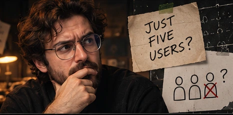
User. Singular.
I went back to the recruitment promise. I had spent months looking for the contradiction. It was right there in the wording.
User-centered. User. Singular.
One user. David. Everyone else was traffic.
I thought the roadmap had ignored the user. It had been built entirely around him.
Design Conspirators is a satirical series by Designshot. Lawrence’s investigations are fictional. These field notes accompany a preview episode.